Content modified under Creative Commons Attribution license CC-BY 4.0, code under BSD 3-Clause License © 2020 R.C. Cooper, L.A. Barba, N.C. Clementi
02 - Seeing stats in a new light#
Welcome to the second lesson in “Analyze Data,” Module 2 of your series in Computational Mechanics. In the previous lesson, Cheers! Stats with Beers, You did some exploratory data analysis with a data set of canned craft beers in the US [1]. We’ll continue using that same data set here, but with a new focus on visualizing statistics.
In her lecture “Looking at Data”, Prof. Kristin Sainani says that you should always plot your data. Immediately, several things can come to light: are there outliers in your data? (Outliers are data points that look abnormally far from other values in the sample.) Are there data points that don’t make sense? (Errors in data entry can be spotted this way.) And especially, you want to get a visual representation of how data are distributed in your sample.
In this lesson, you’ll play around with different ways of visualizing data. You have so many ways to play! Have a look at the gallery of The Data Viz Project by ferdio (a data viz agency in Copenhagen). Aren’t those gorgeous? Wouldn’t you like to be able to make some pretty pics like that? Python can help!
Let’s begin. You’ll import your favorite Python libraries, and set some font parameters for your plots to look nicer. Then you’ll load our data set for craft beers and begin!
import numpy as np
import pandas as pd
import matplotlib.pyplot as plt
plt.style.use('fivethirtyeight')
Read the data#
Like in the previous lesson, you will load the data from a .csv file. You may have the file in your working directory if you downloaded it when working through the previous lesson. In that case, you could load it like this:
beers = pd.read_csv("beers.csv")
If you downloaded the full set of lesson files from your public repository, you can find the file in the /data folder, and you can load it with the full path:
# Load the beers data set using pandas, and assign it to a dataframe
beers = pd.read_csv("../data/beers.csv")
Note:#
If you don’t have the data file locally, download it by adding a code cell, and executing the following code in it:
from urllib.request import urlretrieve
URL = 'http://go.gwu.edu/engcomp2data1?accessType=DOWNLOAD'
urlretrieve(URL, 'beers.csv')
The data file will be downloaded to your working directory, and you will load it like described above.
OK. Let’s have a look at the first few rows of the pandas dataframe
you just created from the file, and confirm that it’s a dataframe using
the type() function. You only display the first 10 rows to save some
space.
type(beers)
pandas.DataFrame
beers[beers['style']=='American IPA']
| Unnamed: 0 | abv | ibu | id | name | style | brewery_id | ounces | |
|---|---|---|---|---|---|---|---|---|
| 2 | 2 | 0.071 | NaN | 2264 | Rise of the Phoenix | American IPA | 177 | 12.0 |
| 4 | 4 | 0.075 | NaN | 2262 | Sex and Candy | American IPA | 177 | 12.0 |
| 28 | 28 | 0.070 | 70.0 | 799 | 21st Amendment IPA (2006) | American IPA | 368 | 12.0 |
| 29 | 29 | 0.070 | 70.0 | 797 | Brew Free! or Die IPA (2008) | American IPA | 368 | 12.0 |
| 30 | 30 | 0.070 | 70.0 | 796 | Brew Free! or Die IPA (2009) | American IPA | 368 | 12.0 |
| ... | ... | ... | ... | ... | ... | ... | ... | ... |
| 2387 | 2390 | 0.059 | 135.0 | 1676 | Troopers Alley IPA | American IPA | 344 | 12.0 |
| 2390 | 2393 | 0.065 | 82.0 | 2417 | 4000 Footer IPA | American IPA | 109 | 12.0 |
| 2392 | 2395 | 0.065 | 69.0 | 1697 | Be Hoppy IPA | American IPA | 339 | 16.0 |
| 2393 | 2396 | 0.069 | 69.0 | 2194 | Worthy IPA | American IPA | 199 | 12.0 |
| 2396 | 2399 | 0.069 | 69.0 | 1512 | Worthy IPA (2013) | American IPA | 199 | 12.0 |
424 rows × 8 columns
beers.columns
Index(['Unnamed: 0', 'abv', 'ibu', 'id', 'name', 'style', 'brewery_id',
       'ounces'],
      dtype='str')
Quantitative vs. categorical data#
As you can see in the nice table that pandas printed for the
dataframe, you have several features for each beer: the label abv
corresponds to the acohol-by-volume fraction, label ibu refers to the
international bitterness unit (IBU), then you have the name of the beer
and the style, the brewery ID number, and the liquid volume of the
beer can, in ounces.
Alcohol-by-volume is a numeric feature: a volume fraction, with possible
values from 0 to 1 (sometimes also given as a percentage). In the first
10 rows of your dataframe, the ibu value is missing (all those NaNs),
but you saw in the previous lesson that ibu is also a numeric feature,
with values that go from a minimum of 4 to a maximum of 138 (in your data
set). IBU is pretty mysterious: how do you measure the bitterness of
beer? It turns out that bitterness is measured as parts per million of
isohumulone, the acid found in hops [2].
For these numeric features, you learned that you can get an idea of the central tendency in the data using the mean value, and you get ideas of spread of the data with the standard deviation (and also with the range, but standard deviation is the most common).
Notice that the beer data also has a feature named style: it can be
“American IPA” or “American Porter” or a bunch of other styles of beer.
If you want to study the beers according to style, you’ll have to come up
with some new ideas, because you can’t take the mean or standard
deviation of this feature!
Quantitative data have meaning through a numeric feature, either on a continuous scale (like a fraction from 0 to 1), or a discrete count. Categorical data, in contrast, have meaning through a qualitative feature (like the style of beer). Data in this form can be collected in groups (categories), and then you can count the number of data items in that group. For example, you could ask how many beers (in your set) are of the style “American IPA,” or ask how many beers you have in each style.
Visualizing quantitative data#
In the previous lesson, you played around a bit with the abv and ibu
columns of the dataframe beers. For each of these columns, you
extracted it from the dataframe and saved it into a pandas series,
then you used the dropna() method to get rid of null values. This
“clean” data was your starting point for some exploratory data analysis,
and for plotting the data distributions using histograms. Here, you
will add a few more ingredients to your recipes for data exploration, and
you’ll learn about a new type of visualization: the box plot.
Let’s repeat here the process for extracting and cleaning the two series, and getting the values into NumPy arrays:
#Repeat cleaning values abv
abv_series = beers['abv']
abv_clean = abv_series.dropna()
abv = abv_clean.values
#Repeat cleaning values ibu
ibu_series = beers['ibu']
ibu_clean = ibu_series.dropna()
ibu = ibu_clean.values
Let’s also repeat a histogram plot for the abv variable, but this time choose to plot just 10 bins (you’ll see why in a moment).
plt.figure(figsize=(6,4))
plt.hist(abv, bins=10, color='b', histtype='bar', edgecolor='w')
plt.title('Alcohol by Volume (abv) \n')
plt.xlabel('abv')
plt.ylabel('Frequency');
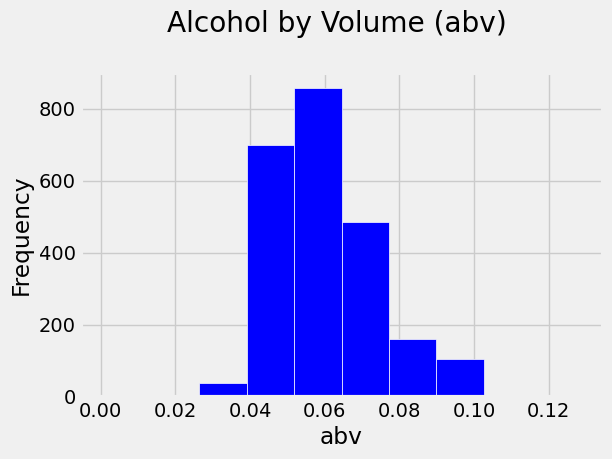
You can tell that the most frequent values of abv fall in the bin just
above 0.05 (5% alcohol), and the bin below. The mean value of your data
is 0.06, which happens to be within the top-frequency bin, but data is
not always so neat (sometimes, extreme values weigh heavily on the
mean). Note also that you have a right skewed distribution, with
higher-frequency bins occuring in the lower end of the range than in the
higher end.
If you played around with the bin sizes in the previous lesson, you might have noticed that with a lot of bins, it becomes harder to visually pick out the patterns in the data. But if you use too few bins, the plot is also unhelpful. What number of bins is just right? Well, it depends on your data, so you’ll just have to experiment and use your best judgement.
Let’s learn a new trick. It turns out that pandas has built-in methods to make histograms directly from columns of a dataframe! (It uses Matplotlib internally for that.) The syntax is short and sweet:
dataframe.hist(column='label')
And pandas plots a pretty nice histogram without help. You can add optional parameters to set these to your liking; see the documentation. Check it out, and compare with your previous plot.
beers.hist(column='abv', edgecolor='white')
plt.title('Alcohol by Volume (abv) \n');
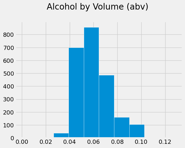
Which one do you like better? Well, the pandas histogram took fewer lines of code to create. And it doesn’t look bad at all. But you do have more fine-grained control with Matplotlib. Which method you choose in a real situation will just depend on the situation and your preference.
Exploring quantitative data (continued)#
In the previous lesson, you learned how to compute the mean of the data using np.mean(). How easy is that? But then you wrote your own custom functions to compute variance or standard deviation. There are some standard numpy libraries that you can use instead.
Exercise:#
Go to the documentation of
np.var()and analyze if this function is computing the sample variance. Hint: Check what it says about the “data degrees of freedom.”
If you did the reading, you might have noticed that, by default, the argument ddof in np.var() is set to zero. If you use the default option, then you are not really calculating the sample variance. Recall from the previous lesson that the sample variance is:
Therefore, you need to be explicit about the division by \(N-1\) when calling np.var(). How do you do that? you explicitly set ddof to 1.
For example, to compute the sample variance for your abv variable, you do:
var_abv = np.var(abv, ddof = 1)
Now, you can compute the standard deviation by taking the square root of var_abv:
std_abv = np.sqrt(var_abv)
print(std_abv)
0.013541733716680264
You might be wondering if there is a built-in function for the standard deviation in NumPy. Go on and search online and try to find something.
Spoiler alert! You will.
Exercise:#
Read the documentation about the NumPy standard deviation function, compute the standard deviation for
abvusing this function, and check that you obtained the same value than if you take the square root of the variance computed with NumPy.Compute the variance and standard deviation for the variable
ibu.
?np.std
np.std(abv,ddof=1)
np.float64(0.013541733716680264)
Median value#
So far, you’ve learned to characterize quantitative data using the mean, variance and standard deviation.
If you watched Prof. Sainani’s lecture Describing Quantitative Data: Where is the center? (recommended in your previous lesson), you’ll recall that she also introduced the median: the middle value in the data, the value that separates your data set in half. (If there’s an even number of data values, you take the average between the two middle values.)
As you may anticipate, NumPy has a built-in function that computes the median, helpfully named numpy.median().
Exercise:#
Using NumPy, compute the median for your variables abv and ibu. Compare the median with the mean, and look at the histogram to locate where the values fall on the x-axis.
Box plots#
Another handy way to visualize the distribution of quantitative data is using box plots. By “distribution” of the data, you mean some idea of the dataset’s “shape”: where is the center, what is the range, what is the variation in the data.
Histograms are the most popular type of plots in exploratory data analysis. But check out box plots: they are easy to make with pyplot:
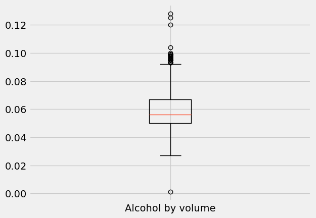
plt.boxplot(abv, labels=['Alcohol by volume']);
/tmp/ipykernel_70601/315735715.py:1: MatplotlibDeprecationWarning: The 'labels' parameter of boxplot() has been renamed 'tick_labels' since Matplotlib 3.9; support for the old name will be dropped in 3.11.
  plt.boxplot(abv, labels=['Alcohol by volume']);
plt.boxplot(ibu, labels=['International bitterness unit']);
/tmp/ipykernel_70601/1528684497.py:1: MatplotlibDeprecationWarning: The 'labels' parameter of boxplot() has been renamed 'tick_labels' since Matplotlib 3.9; support for the old name will be dropped in 3.11.
  plt.boxplot(ibu, labels=['International bitterness unit']);
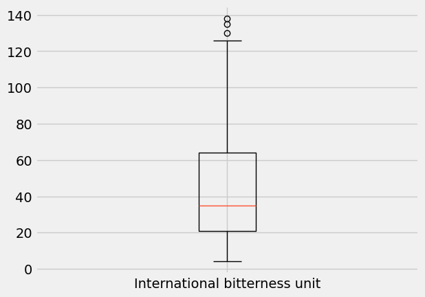
What is going on here? Obviously, there is a box: it represents 50% of the data in the middle of the data range, with the line across it (here, in orange) indicating the median.
The bottom of the box is at the 25th percentile, while the top of the box is at the 75th percentile. In other words, the bottom 25% of the data falls below the box, and the top 25% of the data falls above the box.
Confused by percentiles? The Nth percentile is the value below which N% of the observations fall.
Recall the bell curve from your previous lesson: you said that 95% of the data falls at a distance \(\pm 2 \sigma\) from the mean. This implies that 5% of the data (the rest) falls in the (symmetrical) tails, which in turn implies that the 2.5 percentile is at \(-2\sigma\) from the mean, and the 97.5 percentile is at \(+2\sigma\) from the mean.
The percentiles 25, 50, and 75 are also named quartiles, since they divide the data into quarters. They are named first (Q1), second (Q2 or median) and third quartile (Q3), respectively.
Fortunately, NumPy has a function to compute percentiles and you can do it in just one line. Let’s use np.percentile() to compute the abv and ibu quartiles.
** abv quartiles **
Q1_abv = np.percentile(abv, q=25)
Q2_abv = np.percentile(abv, q=50)
Q3_abv = np.percentile(abv, q=75)

print('The first quartile for abv is {}'.format(Q1_abv))
print('The second quartile for abv is {}'.format(Q2_abv))
print('The third quartile for abv is {}'.format(Q3_abv))
The first quartile for abv is 0.05
The second quartile for abv is 0.0559999999999999
The third quartile for abv is 0.067
ibu quartiles
You can also pass a list of percentiles to np.percentile() and calculate several of them in one go. For example, to compute the quartiles of ibu, you do:
quartiles_ibu = np.percentile(ibu, q=[25, 50, 75])

print('The first quartile for ibu is {}'.format(quartiles_ibu[0]))
print('The second quartile for ibu is {}'.format(quartiles_ibu[1]))
print('The third quartile for ibu is {}'.format(quartiles_ibu[2]))
The first quartile for ibu is 21.0
The second quartile for ibu is 35.0
The third quartile for ibu is 64.0
OK, back to box plots. The height of the box—between the 25th and 75th percentile—is called the interquartile range (IQR). Outside the box, you have two vertical lines—the so-called “whiskers” of the box plot—which used to be called “box and whiskers plot” [3].
The whiskers extend to the upper and lower extremes (short horizontal lines). The extremes follow the following rules:
Top whisker: lower value between the maximum and
Q3 + 1.5 x IQR.Bottom whisker: higher value between the minimum and
Q1 - 1.5 x IQR
Any data values beyond the upper and lower extremes are shown with a marker (here, small circles) and are an indication of outliers in the data.
Exercise:#
Calculate the end-points of the top and bottom whiskers for both the abv and ibu variables, and compare the results with the whisker end-points you see in the plot.
IQR = quartiles_ibu[2]-quartiles_ibu[0]
TW = np.min([np.max(ibu),quartiles_ibu[2]+1.5*IQR])
BW = np.max([np.min(ibu),quartiles_ibu[0]-1.5*IQR])

print('ibu:\n----------------')
print('top whisker = {:.1f} ibu'.format(TW))
print('bottom whisker = {:.1f} ibu'.format(BW))

quartiles_abv = np.percentile(abv, q=[25, 50, 75])

IQR = quartiles_abv[2]-quartiles_abv[0]
TW = np.min([np.max(abv),quartiles_abv[2]+1.5*IQR])
BW = np.max([np.min(abv),quartiles_abv[0]-1.5*IQR])

print('\nabv:\n----------------')
print('top whisker = {:.1f}% abv'.format(TW*100))
print('bottom whisker = {:.1f}% abv'.format(BW*100))
ibu:
----------------
top whisker = 128.5 ibu
bottom whisker = 4.0 ibu

abv:
----------------
top whisker = 9.2% abv
bottom whisker = 2.5% abv
A bit of history:#
“Box-and-whiskers” plots were invented by John Tukey over 45 years ago. Tukey was a famous mathematician/statistician who is credited with coining the words software and bit [4]. He was active in the efforts to break the Enigma code during WWII, and worked at Bell Labs in the first surface-to-air guided missile (“Nike”). A classic 1947 work on early design of the electonic computer acknowledged Tukey: he designed the electronic circuit for computing addition. Tukey was also a long-time advisor for the US Census Bureau, and a consultant for the Educational Testing Service (ETS), among many other contributions [5].
Note:#
Box plots are also drawn horizontally. Often, several box plots are drawn side-by-side with the purpose of comparing distributions.
Visualizing categorical data#
The typical method of visualizing categorical data is using bar plots. These show visually the frequency of appearance of items in each category, or the proportion of data in each category. Suppose you wanted to know how many beers of the same style are in your data set. Remember: the style of the beer is an example of categorical data. Let’s extract the column with the style information from the beers dataframe, assign it to a variable named style_series, check the type of this variable, and view the first 10 elements.
style_series = beers['style']
type(style_series)
pandas.Series
style_series.unique()
<StringArray>
[                'American Pale Lager',             'American Pale Ale (APA)',
                        'American IPA',      'American Double / Imperial IPA',
                       'Oatmeal Stout',                     'American Porter',
              'Saison / Farmhouse Ale',                         'Belgian IPA',
                               'Cider',                       'Baltic Porter',
                              'Tripel',                 'American Barleywine',
                       'Winter Warmer',                      'American Stout',
              'Fruit / Vegetable Beer',                  'English Strong Ale',
                  'American Black Ale',                    'Belgian Dark Ale',
                 'American Blonde Ale',            'American Amber / Red Ale',
                  'Berliner Weissbier',                  'American Brown Ale',
             'American Pale Wheat Ale',             'Belgian Strong Dark Ale',
                              'Kölsch',                    'English Pale Ale',
          'American Amber / Red Lager',                  'English Barleywine',
                  'Milk / Sweet Stout',                     'German Pilsener',
                         'Pumpkin Ale',                    'Belgian Pale Ale',
                    'American Pilsner',                   'American Wild Ale',
                   'English Brown Ale',                             'Altbier',
      'California Common / Steam Beer',                                'Gose',
                           'Cream Ale',                        'Vienna Lager',
                             'Witbier',    'American Double / Imperial Stout',
                 'Munich Helles Lager',                         'Schwarzbier',
                'Märzen / Oktoberfest', 'Extra Special / Strong Bitter (ESB)',
                            'Rye Beer',                     'Euro Dark Lager',
                          'Hefeweizen',              'Foreign / Export Stout',
                               'Other',        'English India Pale Ale (IPA)',
                      'Czech Pilsener',                 'American Strong Ale',
                                'Mead',                     'Euro Pale Lager',
                  'American White IPA',           'Dortmunder / Export Lager',
                     'Irish Dry Stout',              'Scotch Ale / Wee Heavy',
                 'Munich Dunkel Lager',                              'Radler',
                                'Bock',               'English Dark Mild Ale',
                       'Irish Red Ale',                           'Rauchbier',
                      'Bière de Garde',                          'Doppelbock',
                        'Dunkelweizen',             'Belgian Strong Pale Ale',
                              'Dubbel',                    'Quadrupel (Quad)',
              'Russian Imperial Stout',               'English Pale Mild Ale',
               'Maibock / Helles Bock',                'Herbed / Spiced Beer',
              'American Adjunct Lager',                        'Scottish Ale',
                         'Smoked Beer',                         'Light Lager',
                    'Abbey Single Ale',                          'Roggenbier',
                       'Kristalweizen',             'American Dark Wheat Ale',
                       'English Stout',                             'Old Ale',
  'American Double / Imperial Pilsner',                    'Flanders Red Ale',
          'Keller Bier / Zwickel Bier',           'American India Pale Lager',
                              'Shandy',                           'Wheat Ale',
                'American Malt Liquor',                      'English Bitter',
                          'Chile Beer',                            'Grisette',
                  'Flanders Oud Bruin',                             'Braggot',
                    'Low Alcohol Beer']
Length: 99, dtype: str
Already in the first 10 elements you see that you have two beers of the style “American IPA,” two beers of the style “American Pale Ale (APA),” but only one beer of the style “Oatmeal Stout.” The question is: how many beers of each style are contained in the whole series?
Luckily, pandas has a built-in function to answer that question: series.value_counts() (where series is the variable name of the pandas series you want the counts for). Let’s try it on your style_series, and save the result in a new variable named style_counts.
style_counts = style_series.value_counts()
print(style_counts[-50:])
style
American Double / Imperial Stout      9
Schwarzbier                           9
Herbed / Spiced Beer                  9
Bock                                  7
Bière de Garde                        7
Doppelbock                            7
Belgian Strong Pale Ale               7
American Dark Wheat Ale               7
Baltic Porter                         6
Belgian Strong Dark Ale               6
American Wild Ale                     6
California Common / Steam Beer        6
Foreign / Export Stout                6
Dortmunder / Export Lager             6
English Dark Mild Ale                 6
Euro Dark Lager                       5
Mead                                  5
Irish Dry Stout                       5
Dubbel                                5
Maibock / Helles Bock                 5
English Strong Ale                    4
Munich Dunkel Lager                   4
Dunkelweizen                          4
Quadrupel (Quad)                      4
American Barleywine                   3
English Barleywine                    3
Radler                                3
English Pale Mild Ale                 3
Keller Bier / Zwickel Bier            3
American India Pale Lager             3
Shandy                                3
English Bitter                        3
Chile Beer                            3
Euro Pale Lager                       2
Rauchbier                             2
Abbey Single Ale                      2
Roggenbier                            2
English Stout                         2
Old Ale                               2
American Double / Imperial Pilsner    2
Other                                 1
Smoked Beer                           1
Kristalweizen                         1
Flanders Red Ale                      1
Wheat Ale                             1
American Malt Liquor                  1
Grisette                              1
Flanders Oud Bruin                    1
Braggot                               1
Low Alcohol Beer                      1
Name: count, dtype: int64
type(style_counts)
pandas.Series
len(style_counts)
99
The len() function tells us that style_counts has 99 elements. That is, there are a total of 99 styles of beer in your data set. Wow, that’s a lot!
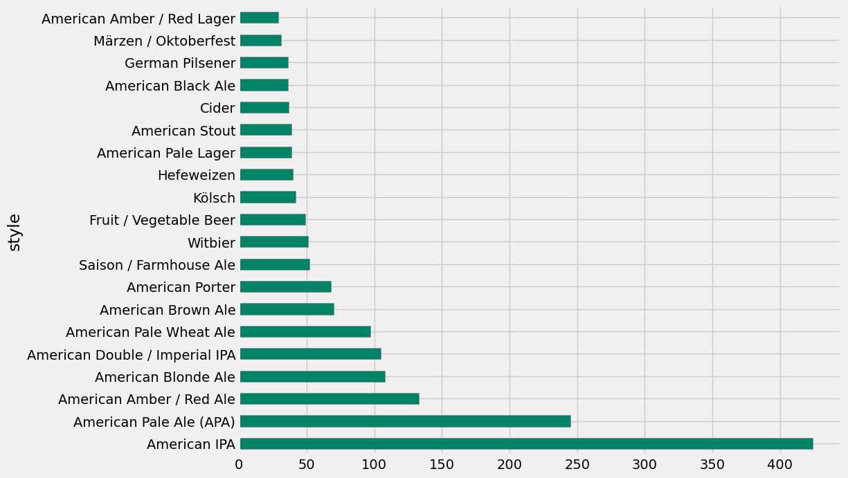
Notice that value_counts() returned the counts sorted in decreasing order: the most popular beer in your data set is “American IPA” with 424 entries in our data. The next-most popular beer is “American Pale Ale (APA)” with a lot fewer entries (245), and the counts decrease sharply after that. Naturally, you’d like to know how much more popular are the top-2 beers from the rest. Bar plot to the rescue!
Below, you’ll draw a horizontal bar plot directly with pandas (which uses Matplotlib internally) using the plot.barh() method for series. We’ll only show the first 20 beers, because otherwise you’ll get a huge plot. This plot gives us a clear visualization of the popularity ranking of beer styles in the US!
style_counts[0:20].plot.barh(figsize=(10,8), color='#008367', edgecolor='gray');
Visualizing multiple data#
These visualizations are really addictive! We’re now getting ambitious: what if you wanted to show more than one feature, together on the same plot? What if you wanted to get insights about the relationship between two features through a multi-variable plot?
For example, you can explore the relationship between bitterness of beers and the alcohol-by-volume fraction.
Scatter plots#
Maybe you can do this: imagine a plot that has the alcohol-by-volume on the absissa, and the IBU value on the ordinate. For each beer, you can place a dot on this plot with its abv and ibu values as \((x, y)\) coordinates. This is called a scatter plot.
We run into a bit of a problem, though. The way you handled the beer data above, you extracted the column for abv into a series, dropped the null entries, and saved the values into a NumPy array. You then repeated this process for the ibu column. Because a lot more ibu values are missing, you ended up with two arrays of different length: 2348 entries for the abv series, and 1405 entries for the ibu series. If you want to make a scatter plot with these two features, you’ll need series (or arrays) of the same length.
Let’s instead clean the whole beers dataframe (which will completely remove any row that has a null entry), and then extract the values of the two series into NumPy arrays.
beers_clean = beers.dropna()
ibu = beers_clean['ibu'].values
len(ibu)
1405
abv = beers_clean['abv'].values
len(abv)
1405
Notice that both arrays now have 1403 entries—not 1405 (the length of the clean ibu data), because two rows that had a non-null ibu value did have a null abv value and were dropped.
With the two arrays of the same length, you can now call the pyplot.scatter() function.
plt.figure(figsize=(8,8))
plt.scatter(abv, ibu, color='#3498db')
plt.title('Scatter plot of alcohol-by-volume vs. IBU \n')
plt.xlabel('abv')
plt.ylabel('IBU');
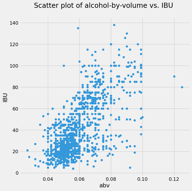
Hmm. That’s a bit of a mess. Too many dots! But you do make out that the beers with low alcohol-by-volume tend to have low bitterness. For higher alcohol fraction, the beers can be anywhere on the bitterness scale: there’s a lot of vertical spread on those dots to the right of the plot.
An idea! What if the bitterness has something to do with style?
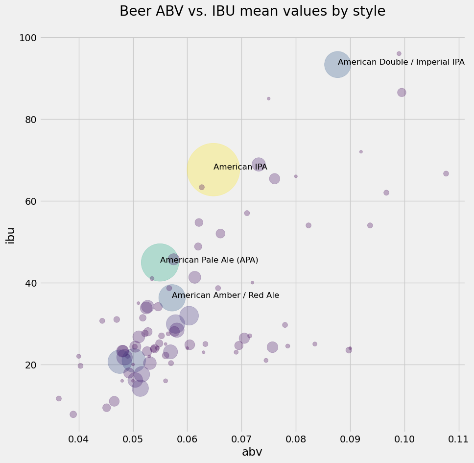
Bubble chart#
What you imagined is that you could group together the beers by style, and then make a new scatter plot where each marker corresponds to a style. The beers within a style, though, have many values of alcohol fraction and bitterness: you have to come up with a “summary value” for each style. Well, why not the mean… you can calculate the average abv and the average ibu for all the beers in each style, use that pair as \((x,y)\) coordinate, and put a dot there representing the style.
Better yet! We’ll make the size of the “dot” proportional to the popularity of the style in your data set! This is called a bubble chart.
How to achieve this idea? you searched online for “mean of a column with pandas” and you landed in dataframe.mean(). This could be helpful… But you don’t want the mean of a whole column—we want the mean of the column values grouped by style. Searching online again, you landed in dataframe.groupby(). This is amazing: pandas can group a series for you!
Here’s what you want to do: group beers by style, then compute the mean of abv and ibu in the groups. You experimented with beers_clean.groupby('style').mean() and were amazed… However, one thing was bothersome: pandas computed the mean (by style) of every column, including the id and brewery_id, which have no business being averaged. So you decided to first drop the columns you don’t need, leaving only abv, ibu and style. You can use the dataframe.drop() method for that. Check it out!
beers_styles = beers_clean.drop(['Unnamed: 0','name','brewery_id','ounces','id'], axis=1)
We now have a dataframe with only the numeric features abv and ibu, and the categorical feature style. Let’s find out how many beers you have of each style—you’d like to use this information to set the size of the style bubbles.
style_counts = beers_styles['style'].value_counts()
type(style_counts)
pandas.Series
len(style_counts)
90
The number of beers in each style appears on each row of style_counts, sorted in decreasing order of count. You have 90 different styles, and the most popular style is the “American IPA,” with 301 beers…
Discuss with your neighbor:#
What happened? you used to have 99 styles and 424 counts in the “American IPA” style. Why is it different now?
OK. You want to characterize each style of beer with the mean values of the numeric features, abv and ibu, within that style. Let’s get those means.
style_means = beers_styles.groupby('style').mean()
style_means
| abv | ibu | |
|---|---|---|
| style | ||
| Abbey Single Ale | 0.049000 | 22.000000 |
| Altbier | 0.054625 | 34.125000 |
| American Adjunct Lager | 0.046545 | 11.000000 |
| American Amber / Red Ale | 0.057195 | 36.298701 |
| American Amber / Red Lager | 0.048062 | 23.250000 |
| ... | ... | ... |
| Tripel | 0.089750 | 23.500000 |
| Vienna Lager | 0.050429 | 24.357143 |
| Wheat Ale | 0.060000 | 24.000000 |
| Winter Warmer | 0.069500 | 24.625000 |
| Witbier | 0.050417 | 16.208333 |
90 rows × 2 columns
Looking good! you have the information you need: the average abv and ibu by style, and the counts by style. The only problem is that style_counts is sorted by decreasing count value, while style_means is sorted alphabetically by style. Ugh.
Notice that style_means is a dataframe that is now using the style string as a label for each row. Meanwhile, style_counts is a pandas series, and it also uses the style as label or index to each element.
More online searching and you find the series.sort_index() method. It will sort your style counts in alphabetical order of style, which is what you want.
style_counts = style_counts.sort_index()
style_counts[0:10]
style
Abbey Single Ale               2
Altbier                        8
American Adjunct Lager        11
American Amber / Red Ale      77
American Amber / Red Lager    16
American Barleywine            2
American Black Ale            20
American Blonde Ale           61
American Brown Ale            38
American Dark Wheat Ale        5
Name: count, dtype: int64
Above, you used Matplotlib to create a scatter plot using two NumPy arrays as the x and y parameters. Like you saw previously with histograms, pandas also has available some plotting methods (calling Matplotlib internally). Scatter plots made easy!
style_means.plot.scatter(figsize=(8,8),
                         x='abv', y='ibu', s=style_counts,
                         title='Beer ABV vs. IBU mean values by style');
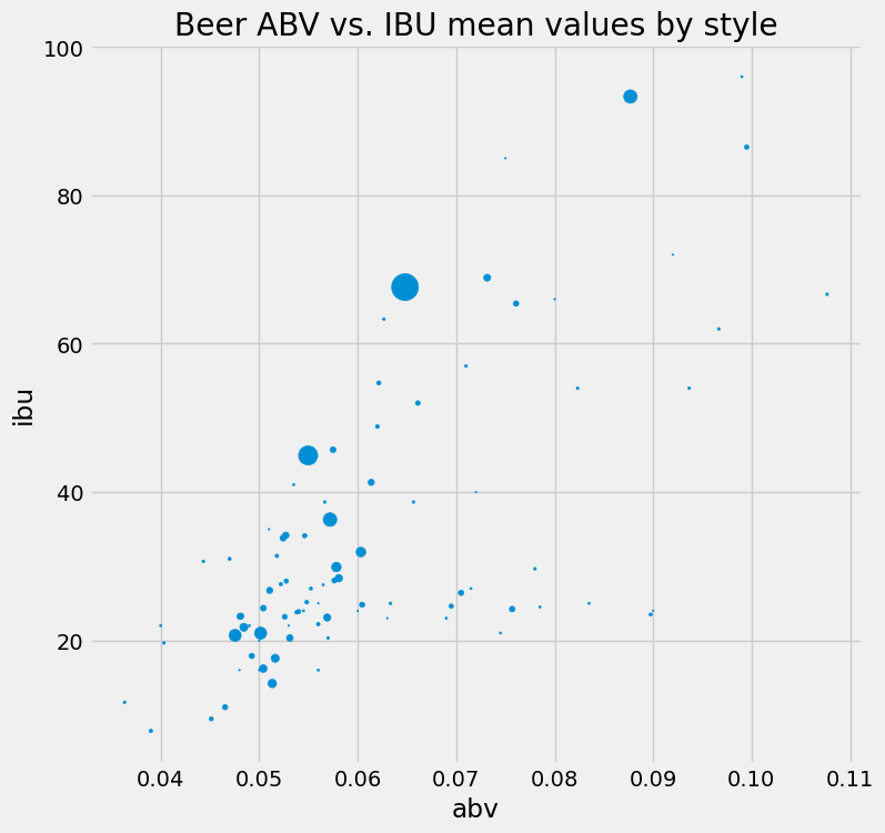
That’s rad! Perhaps the bubbles are too small. You could multiply the style_counts by a factor of 5, or maybe 10? You should experiment.
But you are feeling gung-ho about this now, and decided to find a way to make the color of the bubbles also vary with the style counts. Below, you import the colormap module of Matplotlib, and you set your colors using the viridis colormap on the values of style_counts, then you repeat the plot with these colors on the bubbles and some transparency. What do you think?
from matplotlib import cm
colors = cm.viridis(style_counts.values)
style_means.plot.scatter(figsize=(10,10),
                         x='abv', y='ibu', s=style_counts*20, color=colors,
                         title='Beer ABV vs. IBU mean values by style\n',
                         alpha=0.3); #alpha sets the transparency
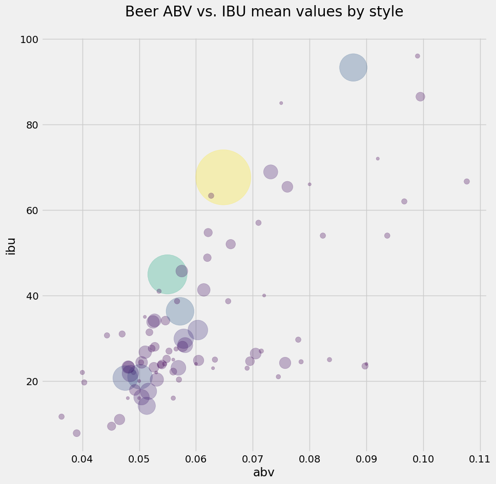
It looks like the most popular beers do follow a linear relationship between alcohol fraction and IBU. You learned a lot about beer without having a sip!
Wait… one more thing! What if you add a text label next to the bigger bubbles, to identify the style?
OK, here you go a bit overboard, but you couldn’t help it. You played around a lot to get this version of the plot. It uses enumerate to get pairs of indices and values from a list of style names; an if statement to select only the large-count styles; and the iloc[] slicing method of pandas to get a slice based on index position, and extract abv and ibu values to an \((x,y)\) coordinate for placing the annotation text. Are you overkeen or what!
ax = style_means.plot.scatter(figsize=(10,10),
                               x='abv', y='ibu', s=style_counts*20, color=colors,
                               title='Beer ABV vs. IBU mean values by style\n',
                               alpha=0.3);

for i, txt in enumerate(list(style_counts.index.values)):
    if style_counts.values[i] > 65:
        ax.annotate(txt, (style_means.abv.iloc[i],style_means.ibu.iloc[i]), fontsize=12)
What you’ve learned#
You should always plot your data.
The concepts of quantitative and categorical data.
Plotting histograms directly on columns of dataframes, using
pandas.Computing variance and standard deviation using NumPy built-in functions.
The concept of median, and how to compute it with NumPy.
Making box plots using
pyplot.Five statistics of a box plot: the quartiles Q1, Q2 (median) and Q3 (and interquartile range Q3\(-\)Q1), upper and lower extremes.
Visualizing categorical data with bar plots.
Visualizing multiple data with scatter plots and bubble charts.
pandasis awesome!
References#
Craft beer datatset by Jean-Nicholas Hould.
What’s The Meaning Of IBU? by Jim Dykstra for The Beer Connoisseur (2015).
40 years of boxplots (2011). Hadley Wickham and Lisa Stryjewski, Am. Statistician. PDF available
John Wilder Tukey, Encyclopædia Britannica.
John W. Tukey: His life and professional contributions (2002). David R. Brillinger, Ann. Statistics. PDF available