Content modified under Creative Commons Attribution license CC-BY 4.0, code under BSD 3-Clause License © 2020 R.C. Cooper, L.A. Barba, N.C. Clementi
01 - Cheers! Stats with Beers#
Welcome to the second module in Computational Mechanics, your series in computational thinking for undergraduate engineering students. This module explores practical data and statistical analysis with Python.
This first lesson explores how you can answer questions using data combined with practical methods from statistics.
You’ll need data. Here is a great data set of canned craft beers in the US, scraped from the web and cleaned up by Jean-Nicholas Hould (@NicholasHould on Twitter)—who we want to thank for having a permissive license on his GitHub repository so we can reuse his work!
The data source (@craftcans on Twitter) doesn’t say that the set includes all the canned beers brewed in the country. So you have to asume that the data is a sample and may contain biases.
You’ll process the data using NumPy—the array library for Python that you learned about in Module 1, lesson 2: Getting Started. You’ll also learn about a new Python library for data analysis called Pandas.
pandas is an open-source library
providing high-performance, easy-to-use data structures and
data-analysis tools. Even though pandas is great for data analysis,
you won’t use all its functions in this lesson. But you’ll learn more about it later on!
You’ll use pandas to read the data file (in csv format, for
comma-separated values), display it in a table, and extract the
columns that you need—which you’ll convert to numpy arrays to work with.
Start by importing the two Python libraries that you need.
import pandas as pd
import numpy as np
Step 1: Read the data file#
Below, you’ll take a peek into the data file, beers.csv, using the
system command head (which you can use with a bang (!), thanks to IPython).
But first, you will download the data using a Python library for opening a URL on the Internet. You created a short URL for the data file in the public repository with your course materials.
The cell below should download the data in your current working directory. The next cell shows you the first few lines of the data.
!head "../data/beers.csv"
,abv,ibu,id,name,style,brewery_id,ounces
0,0.05,,1436,Pub Beer,American Pale Lager,408,12.0
1,0.066,,2265,Devil's Cup,American Pale Ale (APA),177,12.0
2,0.071,,2264,Rise of the Phoenix,American IPA,177,12.0
3,0.09,,2263,Sinister,American Double / Imperial IPA,177,12.0
4,0.075,,2262,Sex and Candy,American IPA,177,12.0
5,0.077,,2261,Black Exodus,Oatmeal Stout,177,12.0
6,0.045,,2260,Lake Street Express,American Pale Ale (APA),177,12.0
7,0.065,,2259,Foreman,American Porter,177,12.0
8,0.055,,2258,Jade,American Pale Ale (APA),177,12.0
You can use pandas to read the data from the csv file, and save it
into a new variable called beers. Let’s then check the type of this
new variable—rememeber that you can use the function type() to do this.
beers = pd.read_csv('../data/beers.csv')
type(beers)
pandas.DataFrame
This is a new data type for us: a pandas DataFrame. From the pandas documentation: “A DataFrame is a 2-dimensional labeled data structure with columns of potentially different types” [4]. You can think of it as the contens of a spreadsheet, saved into one handy Python variable. If you print it out, you get a nicely laid-out table:
beers
| Unnamed: 0 | abv | ibu | id | name | style | brewery_id | ounces | |
|---|---|---|---|---|---|---|---|---|
| 0 | 0 | 0.050 | NaN | 1436 | Pub Beer | American Pale Lager | 408 | 12.0 |
| 1 | 1 | 0.066 | NaN | 2265 | Devil's Cup | American Pale Ale (APA) | 177 | 12.0 |
| 2 | 2 | 0.071 | NaN | 2264 | Rise of the Phoenix | American IPA | 177 | 12.0 |
| 3 | 3 | 0.090 | NaN | 2263 | Sinister | American Double / Imperial IPA | 177 | 12.0 |
| 4 | 4 | 0.075 | NaN | 2262 | Sex and Candy | American IPA | 177 | 12.0 |
| ... | ... | ... | ... | ... | ... | ... | ... | ... |
| 2402 | 2405 | 0.067 | 45.0 | 928 | Belgorado | Belgian IPA | 424 | 12.0 |
| 2403 | 2406 | 0.052 | NaN | 807 | Rail Yard Ale | American Amber / Red Ale | 424 | 12.0 |
| 2404 | 2407 | 0.055 | NaN | 620 | B3K Black Lager | Schwarzbier | 424 | 12.0 |
| 2405 | 2408 | 0.055 | 40.0 | 145 | Silverback Pale Ale | American Pale Ale (APA) | 424 | 12.0 |
| 2406 | 2409 | 0.052 | NaN | 84 | Rail Yard Ale (2009) | American Amber / Red Ale | 424 | 12.0 |
2407 rows × 8 columns
Inspect the table above. The first column is a numbering scheme for the beers. The other columns contain the following data:
abv: Alcohol-by-volume of the beer.ibu: International Bittering Units of the beer.id: Unique identifier of the beer.name: Name of the beer.style: Style of the beer.brewery_id: Unique identifier of the brewery.ounces: Ounces of beer in the can.
Step 2: Explore the data#
In the field of statistics, Exploratory Data Analysis (EDA) has the goal of summarizing the main features of your data, and seeing what the data can tell us without formal modeling or hypothesis-testing. [2]
Let’s start by extracting the columns with the abv and ibu values,
and converting them to numpy arrays. One of the advantages of data
frames in pandas is that you can access a column simply using its header, like this:
data_frame['name_of_column']
The output of this action is a pandas Series. From the documentation: “a Series is a 1-dimensional labeled array capable of holding any data type.” [4]
Check the type of a column extracted by header:
type(beers['abv'])
pandas.Series
Of course, you can index and slice a data series like you know how to do
with strings, lists and arrays. Here, you display the first ten elements of the abv series:
beers['abv'][:10]
0    0.050
1    0.066
2    0.071
3    0.090
4    0.075
5    0.077
6    0.045
7    0.065
8    0.055
9    0.086
Name: abv, dtype: float64
Inspect the data in the table again: you’ll notice that there are NaN (not-a-number) elements in both the abv and ibu columns. Those values mean that there was no data reported for that beer. A typical task when cleaning up data is to deal with these pesky NaNs.
Let’s extract the two series corresponding to the abv and ibu columns, clean the data by removing all NaN values, and then access the values of each series and assign them to a numpy array.
abv_series = beers['abv']
len(abv_series)
2407
Another advantage of pandas is that it has the ability to handle missing data. The data-frame method dropna() returns a new data frame with only the good values of the original: all the null values are thrown out. This is super useful!
abv_clean = abv_series.dropna()
Check out the length of the cleaned-up abv data; you’ll see that it’s shorter than the original. NaNs gone!
len(abv_clean)
2348
Remember that a a pandas Series consists of a column of values, and
their labels. You can extract the values via the
series.values
attribute, which returns a numpy.ndarray (multidimensional array). In
the case of the abv_clean series, you get a one-dimensional array. You save it into the variable name abv.
abv = abv_clean.values
print(abv)
[0.05 0.066 0.071 ... 0.055 0.055 0.052]
type(abv)
numpy.ndarray
Now, repeat the whole process for the ibu column: extract the column
into a series, clean it up removing NaNs, extract the series values as
an array, check how many values you lost.
ibu_series = beers['ibu']

len(ibu_series)
2407
ibu_clean = ibu_series.dropna()

ibu = ibu_clean.values

len(ibu)
1405
Exercise#
Write a Python function that calculates the percentage of missing values for a certain data series. Use the function to calculate the percentage of missing values for the abv and ibu data sets.
For the original series, before cleaning, remember that you can access the values with series.values (e.g., abv_series.values).
Important:
Notice that in the case of the variable
ibuyou are missing almost 42% of the values. This is important, because it will affect your analysis. When you do descriptive statistics, you will ignore these missing values, and having 42% missing will very likely cause bias.
Step 3: Ready, stats, go!#
Now, that you have numpy arrays with clean data, let’s see how you can process them to get some useful information.
Focusing on the numerical variables abv and ibu, you’ll walk through
some “descriptive statistics,” below. In other words, you aim to generate
statistics that summarize the data concisely.
Maximum and minimum#
The maximum and minimum values of a dataset are helpful as they tell us
the range of your sample: the range gives some indication of the variability in the data.
You can obtain them for your abv and ibu arrays with the min() and max() functions from numpy.
abv
abv_min = np.min(abv)
abv_max = np.max(abv)
print('The minimum value for abv is: ', abv_min)
print('The maximum value for abv is: ', abv_max)
The minimum value for abv is:  0.001
The maximum value for abv is:  0.128
ibu
ibu_min = np.min(ibu)
ibu_max = np.max(ibu)
print('The minimum value for ibu is: ', ibu_min)
print('The maximum value for ibu is: ', ibu_max)
The minimum value for ibu is:  4.0
The maximum value for ibu is:  138.0
Mean value#
The mean value is one of the main measures to describe the central tendency of the data: an indication of where’s the “center” of the data. If you have a sample of \(N\) values, \(x_i\), the mean, \(\bar{x}\), is calculated by:
\(\bar{x} = \frac{1}{N}\sum_{i} x_i\)
In words, that is the sum of the data values divided by the number of values, \(N\).
You’ve already learned how to write a function to compute the mean in
Module 1 Lesson 5, but you also
learned that numpy has a built-in mean() function. You’ll use this to
get the mean of the abv and ibu values.
abv_mean = np.mean(abv)
ibu_mean = np.mean(ibu)
Next, you’ll print these two variables, but you’ll use some fancy new way of printing with Python’s string formatter, string.format(). There’s a sweet site dedicated to Python’s string formatter, called PyFormat, where you can learn lots of tricks!
The basic trick is to use curly brackets {} as placeholder for a variable value that you want to print in the middle of a string (say, a sentence that explains what you are printing), and to pass the variable name as argument to .format(), preceded by the string.
Let’s try something out…
print('The mean value for abv is {} and for ibu {}'.format(abv_mean, ibu_mean))
The mean value for abv is 0.059773424190800666 and for ibu 42.71316725978647
Ugh! That doesn’t look very good, does it? Here’s where Python’s string formatting gets fancy. You can print fewer decimal digits, so the sentence is more readable. For example, if you want to have four decimal digits, specify it this way:
print('The mean value for abv is {:.4f} and for ibu {:.4f}'.format(abv_mean, ibu_mean))
The mean value for abv is 0.0598 and for ibu 42.7132
Inside the curly brackets—the placeholders for the values you want to print—the f is for float and the .4 is for four digits after the decimal dot. The colon here marks the beginning of the format specification (as there are options that can be passed before). There are so many tricks to Python’s string formatter that you’ll usually look up just what you need.
Another useful resource for string formatting is the Python String Format Cookbook. Check it out!
Variance and standard deviation#
While the mean indicates where’s the center of your data, the variance and standard deviation describe the spread or variability of the data. You already mentioned that the range (difference between largest and smallest data values) is also an indication of variability. But the standard deviation is the most common measure of variability.
Prof. Kristin Sainani, of Stanford University, presents this in her online course on Statistics in Medicine. In her lecture “Describing Quantitative Data: What is the variability in the data?”, available on YouTube, she asks: What if someone were to ask you to devise a statistic that gives the avarage distance from the mean? Think about this a little bit.
The distance from the mean, for any data value, is \(x_i - \bar{x}\). So what is the average of the distances from the mean? If you try to simply compute the average of all the values \(x_i - \bar{x}\), some of which are negative, you’ll just get zero! It doesn’t work.
Since the problem is the negative distances from the mean, you might suggest using absolute values. But this is just mathematically inconvenient. Another way to get rid of negative values is to take the squares. And that’s how you get to the expression for the variance: it is the average of the squares of the deviations from the mean. For a set of \(N\) values,
\(\text{var} = \frac{1}{N}\sum_{i} (x_i - \bar{x})^2\)
The variance itself is hard to interpret. The problem with it is that the units are strange (they are the square of the original units). The standard deviation, the square root of the variance, is more meaningful because it has the same units as the original variable. Often, the symbol \(\sigma\) is used for it:
\(\sigma = \sqrt{\text{var}} = \sqrt{\frac{1}{N}\sum_{i} (x_i - \bar{x})^2}\)
Sample vs. population#
The above definitions are used when \(N\) (the number of values) represents the entire population. But if you have a sample of that population, the formulas have to be adjusted: instead of dividing by \(N\) you divide by \(N-1\). This is important, especially when you work with real data since usually you have samples of populations.
The standard deviation of a sample is denoted by \(s\), and the formula is:
\(s = \sqrt{\frac{1}{N-1}\sum_{i} (x_i - \bar{x})^2}\)
Why? This gets a little technical, but the reason is that if you have a sample of the population, you don’t know the real value of the mean, and \(\bar{x}\) is actually an estimate of the mean. That’s why you’ll often find the symbol \(\mu\) used to denote the population mean, and distinguish it with the sample mean, \(\bar{x}\). Using \(\bar{x}\) to compute the standard deviation introduces a small bias: \(\bar{x}\) is computed from the sample values, and the data are on average (slightly) closer to \(\bar{x}\) than the population is to \(\mu\). Dividing by \(N-1\) instead of \(N\) corrects this bias!
Prof. Sainani explains it by saying that you lost one degree of freedom when you estimated the mean using \(\bar{x}\). For example, say you have 100 people and I give you their mean age, and the actual age for 99 people from the sample: you’ll be able to calculate the age of that 100th person. Once you calculated the mean, you only have 99 degrees of freedom left because that 100th person’s age is fixed.
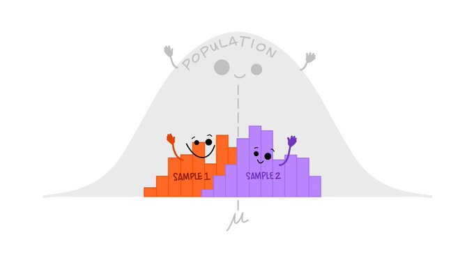
Below is a graphical distinction between the sample and the population from @allison_horst on twitter
Let’s code!#
Now that you have the math sorted out, you can program functions to compute the variance and the standard deviation. In your case, you are working with samples of the population of craft beers, so you need to use the formulas with \(N-1\) in the denominator.
def sample_var(array):
    """ Calculates the variance of an array that contains values of a sample of a
    population.

    Arguments
    ---------
    array : array, contains sample of values.

    Returns
    -------
    var   : float, variance of the array .
    """

    sum_sqr = 0
    mean = np.mean(array)

    for element in array:
        sum_sqr += (element - mean)**2

    N = len(array)
    var = sum_sqr / (N - 1)

    return var
Notice that you used np.mean() in your function: do you think you can make this function even more Pythonic?
Hint: Yes!, you totally can.
Exercise:#
Re-write the function sample_var() using np.sum() to replace the for-loop. Name the function var_pythonic.
def var_pythonic(array):
    """ Calculates the variance of an array that contains values of a sample of a
    population.

    Arguments
    ---------
    array : array, contains sample of values.

    Returns
    -------
    var   : float, variance of the array .
    """

    return var
You have the sample variance, so you take its square root to get the standard deviation. You can make it a function, even though it’s just one line of Python, to make your code more readable:
def sample_std(array):
    """ Computes the standard deviation of an array that contains values
    of a sample of a population.

    Arguments
    ---------
    array : array, contains sample of values.

    Returns
    -------
    std   : float, standard deviation of the array.
    """

    std = np.sqrt(sample_var(array))

    return std
Let’s call your brand new functions and assign the output values to new variables:
abv_std = sample_std(abv)
ibu_std = sample_std(ibu)
If you print these values using the string formatter, only printing 4 decimal digits, you can display your descriptive statistics in a pleasant, human-readable way.
print('The standard deviation for abv is {:.4f} and for ibu {:.4f}'.format(abv_std, ibu_std))
The standard deviation for abv is 0.0135 and for ibu 25.9541
These numbers tell us that the abv values are quite concentrated
around the mean value, while the ibu values are quite spread out from
their mean. How could you check these descriptions of the data? A good way of doing so is using graphics: various types of plots can tell us things about the data.
You’ll learn about histograms in this lesson, and in the following lesson you’ll explore box plots.
Step 4: Distribution plots#
Every time that you work with data, visualizing it is very useful. Visualizations give us a better idea of how your data behaves. One way of visualizing data is with a frequency-distribution plot known as histogram: a graphical representation of how the data is distributed. To make a histogram, first you need to “bin” the range of values (divide the range into intervals) and then you count how many data values fall into each interval. The intervals are usually consecutive (not always), of equal size and non-overlapping.
Thanks to Python and Matplotlib, making histograms is easy. You
recommend that you always read the documentation, in this case about
histograms.
You’ll show you here an example using the hist() function from pyplot, but this is just a starting point.
Let’s first load the Matplotlib module called pyplot, for making
2D plots. Remember that to get the plots inside the notebook, you use a special “magic” command, %matplotlib inline:
from matplotlib import pyplot
%matplotlib inline

#Import rcParams to set font styles
from matplotlib import rcParams
pyplot.hist(abv)
(array([  1.,   0.,  38., 699., 857., 486., 159., 104.,   1.,   3.]),
 array([0.001 , 0.0137, 0.0264, 0.0391, 0.0518, 0.0645, 0.0772, 0.0899,
        0.1026, 0.1153, 0.128 ]),
 <BarContainer object of 10 artists>)
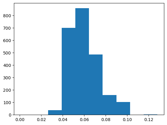
Now, you have a line plot, but if you see this plot without any information you would not be able to figure out what kind of data it is! You need labels on the axes, a title and why not a better color, font and size of the ticks. Publication quality plots should always be your standard for plotting. How you present your data will allow others (and probably you in the future) to better understand your work.
You can customize the style of your plots using parameters for the lines,
text, font and other plot options. You set some style options that apply
for all the plots in the current session with
plt.rc()
Here, you’ll make the font of a specific type and size (sans-serif and 18
points). You can also customize other parameters like line width, color,
and so on (check out the documentation).
#Set font style and size
rcParams['font.family'] = 'sans'
rcParams['lines.linewidth'] = 3
rcParams['font.size'] = 18
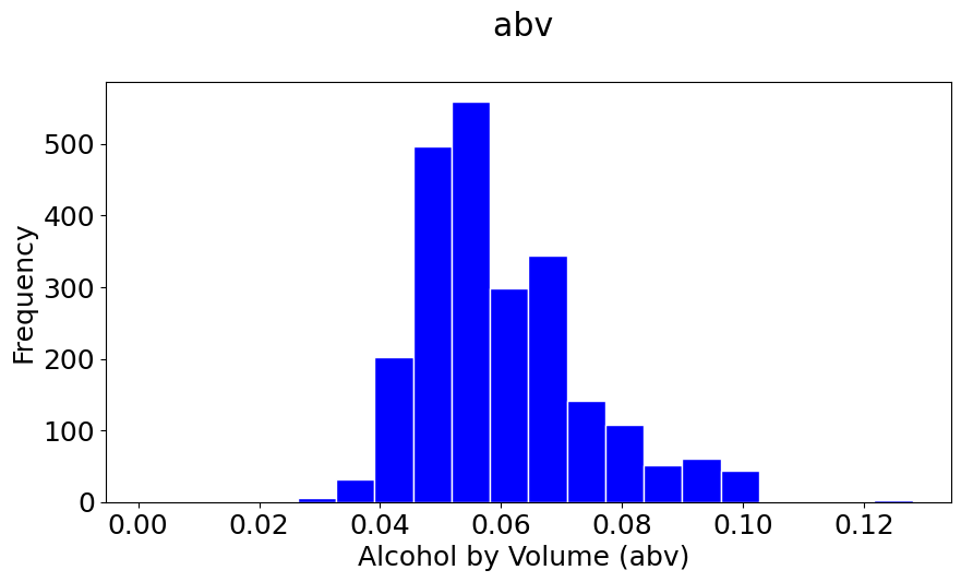
You’ll redo the same plot, but now you’ll add a few things to make it prettier and publication quality. You’ll add a title, label the axes and, show a background grid. Study the commands below and look at the result!
Note: Setting
rcParamsis a great way to control detailed plots, but there are also dozens of matplotlib styles that look great. My recommendation is to keep axis/legend fonts >18 pt and tick labels >16pt. The fivethirtyeight style sheet does a nice job presenting readable plots. Set the style using:plt.style.use('fivethirtyeight')I’ll use this in most of the notebooks.
#You can set the size of the figure by doing:
pyplot.figure(figsize=(10,5))

#Plotting
pyplot.hist(abv, bins=20, color='b', histtype='bar', edgecolor='white')
#The \n is to leave a blank line between the title and the plot
pyplot.title('abv \n')
pyplot.xlabel('Alcohol by Volume (abv) ')
pyplot.ylabel('Frequency');
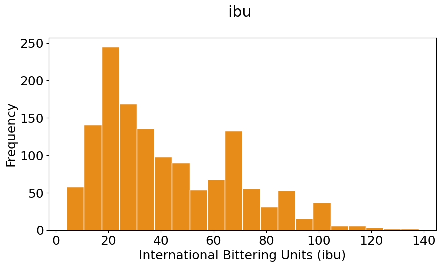
#You can set the size of the figure by doing:
pyplot.figure(figsize=(10,5))

#Plotting
pyplot.hist(ibu, bins=20, color=(0.9, 0.5, 0, 0.9), histtype='bar', edgecolor='white')
#The \n is to leave a blanck line between the title and the plot
pyplot.title('ibu \n')
pyplot.xlabel('International Bittering Units (ibu)')
pyplot.ylabel('Frequency');
In the previous two plots set the colors in two ways:
A string ‘b’, which specifies blue. You could also choose from: a string representation one of
{‘b’, ‘g’, ‘r’, ‘c’, ‘m’, ‘y’, ‘k’, ‘w’} = {blue, green, red, cyan, magenta, yellow, black, white}
A RGB or RGBA (red, green, blue, alpha) tuple of float values in [0, 1] (e.g., (0.1, 0.2, 0.5) or (0.1, 0.2, 0.5, 0.3));
Check out the other formatting options use can use in Matplotlib colors and Matplotlib hist command
Exploratory exercise:#
Play around with the plots, change the values of the bins, colors, etc.
#You can set the size of the figure by doing:
pyplot.figure(figsize=(10,5))

#Plotting
pyplot.hist(ibu, bins=20, color=(0.9, 0.1, 0.3, 0.6), histtype='bar', edgecolor='white')
#pyplot.hist(ibu, bins=20, color=(0.9, 0.8, 0, 0.1), histtype='bar', edgecolor='white')
#pyplot.hist(ibu, bins=20, color=(0.1, 0.1, 0, 0.1), histtype='bar', edgecolor='white')
#The \n is to leave a blanck line between the title and the plot
pyplot.title('ibu \n')
pyplot.xlabel('International Bittering Units (ibu)')
pyplot.ylabel('Frequency');

Comparing with a normal distribution#
A normal (or Gaussian) distribution is a special type of distrubution that behaves as shown in the figure: 68% of the values are within one standard deviation \(\sigma\) from the mean; 95% lie within \(2\sigma\); and at a distance of \(\pm3\sigma\) from the mean, you cover 99.7% of the values. This fact is known as the \(3\)-\(\sigma\) rule, or 68-95-99.7 (empirical) rule.
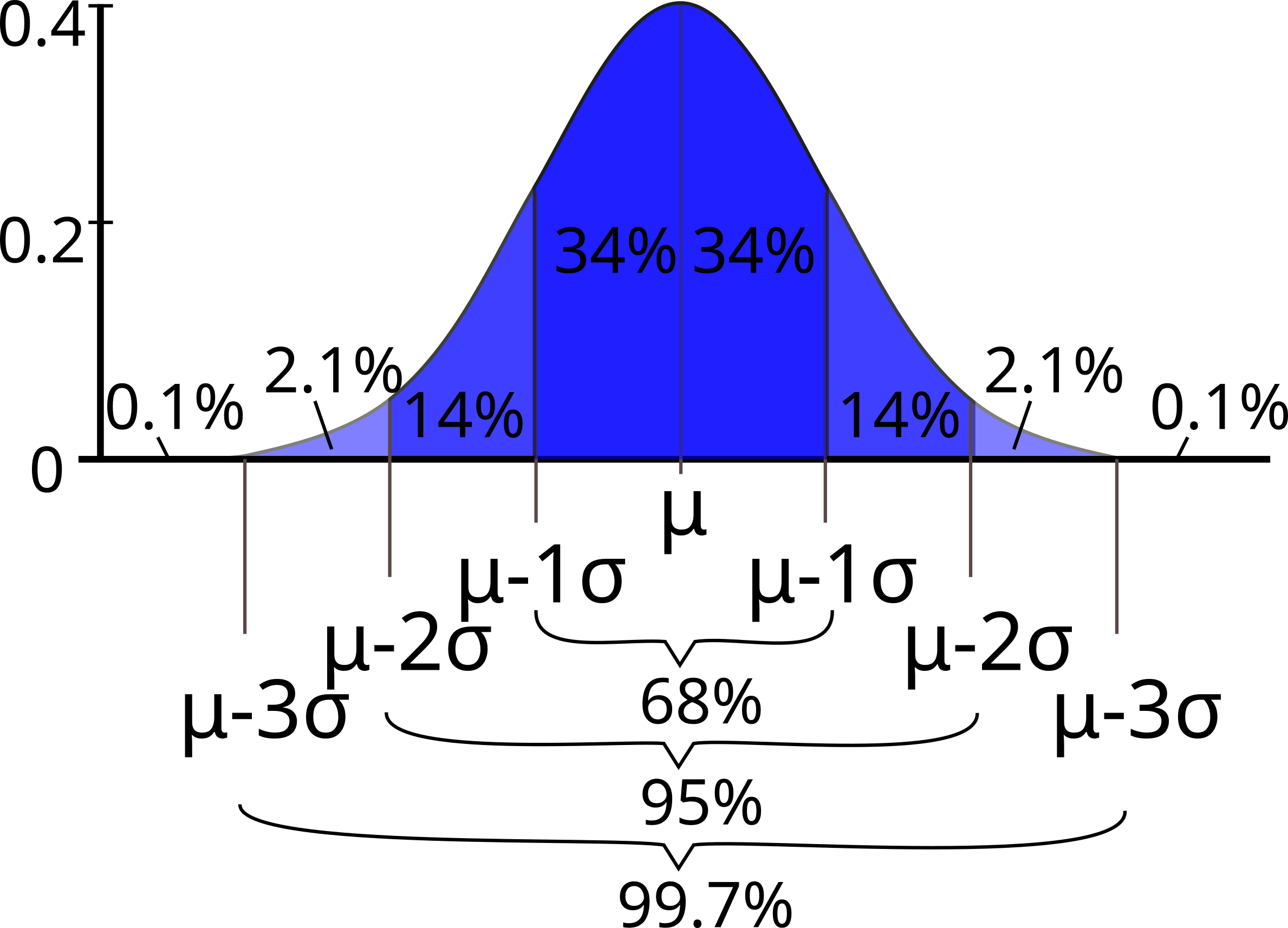
Standard deviation and coverage in a normal distribution. Modified figure based on original from Wikimedia Commons, the free media repository.#
Notice that your histograms don’t follow the shape of a normal distribution, known as Bell Curve. Our histograms are not centered in the mean value, and they are not symetric with respect to it. They are what is call skewed to the right (yes, to the right). A right (or positive) skewed distribution looks like it’s been pushed to the left: the right tail is longer and most of the values are concentrated on the left of the figure. Imagine that “right-skewed” means that a force from the right pushes on the curve.
Discussion point#
How do you think that skewness will affect the percentages of coverage by standard deviation compared to the Bell Curve?
skewness creates a bias towards one or another direction from the mean. You can’t assume the mean and mode are the same value
Can you calculate those percentages?
_with logical operators! x[x<mean_x]/len(x)*100
Exercise#
You can calculate skewness and standard deviation in a few lines of Python. But before doing that, you want you to explain in your own words how the following piece of code works.
Hints:
Check what the logical operation
np.logical_and(1<ibu_clean, ibu_clean<4)returns.Check what happens if you sum booleans. For example,
True + True,True + Falseand so on.
Now, using the same idea, you will calculate the number of elements in each interval of width \((1\sigma, 2\sigma, 3\sigma)\), and get the corresponding percentage.
Since you want to compute this for both of your variables, abv and
ibu, you’ll write a function to do so. Study carefully the code below. Better yet, explain it to your neighbor.
print('ibu 1sigma')
print(np.sum(np.logical_and(ibu_clean<ibu_mean+ibu_std,ibu_clean>ibu_mean-ibu_std)/len(ibu_clean)))
print('ibu 2sigma')
print(np.sum(np.logical_and(ibu_clean<ibu_mean+2*ibu_std,ibu_clean>ibu_mean-2*ibu_std)/len(ibu_clean)))
print('ibu 3sigma')
print(np.sum(np.logical_and(ibu_clean<ibu_mean+3*ibu_std,ibu_clean>ibu_mean-3*ibu_std)/len(ibu_clean)))
ibu 1sigma
0.6811387900355872
ibu 2sigma
0.9565836298932386
ibu 3sigma
0.9971530249110322
print('abv 1sigma')
print(np.sum(np.logical_and(abv_clean<abv_mean+abv_std,abv_clean>abv_mean-abv_std)/len(abv_clean)))
print('abv 2sigma')
print(np.sum(np.logical_and(abv_clean<abv_mean+2*abv_std,abv_clean>abv_mean-2*abv_std)/len(abv_clean)))
print('abv 3sigma')
print(np.sum(np.logical_and(abv_clean<abv_mean+3*abv_std,abv_clean>abv_mean-3*abv_std)/len(abv_clean)))
abv 1sigma
0.7406303236797274
abv 2sigma
0.9433560477001701
abv 3sigma
0.9978705281090289
def std_percentages(x, x_mean, x_std):
    """ Computes the percentage of coverage at 1std, 2std and 3std from the
    mean value of a certain variable x.

    Arguments
    ---------
    x      : array, data you want to compute on.
    x_mean : float, mean value of x array.
    x_std  : float, standard deviation of x array.

    Returns
    -------

    per_std_1 : float, percentage of values within 1 standard deviation.
    per_std_2 : float, percentage of values within 2 standard deviations.
    per_std_3 : float, percentage of values within 3 standard deviations.
    """

    std_1 = x_std
    std_2 = 2 * x_std
    std_3 = 3 * x_std

    elem_std_1 = np.logical_and((x_mean - std_1) < x, x < (x_mean + std_1)).sum()
    per_std_1 = elem_std_1 * 100 / len(x)

    elem_std_2 = np.logical_and((x_mean - std_2) < x, x < (x_mean + std_2)).sum()
    per_std_2 = elem_std_2 * 100 / len(x)

    elem_std_3 = np.logical_and((x_mean - std_3) < x, x < (x_mean + std_3)).sum()
    per_std_3 = elem_std_3 * 100 / len(x)

    return per_std_1, per_std_2, per_std_3
Compute the percentages next. Notice that the function above returns three values. If you want to assign each value to a different variable, you need to follow a specific syntax. In your example this would be:
abv
abv_std1_per, abv_std2_per, abv_std3_per = std_percentages(abv, abv_mean, abv_std)
Pretty-print the values of your variables so you can inspect them:
print('The percentage of coverage at 1 std of the abv_mean is : {:.2f} %'.format(abv_std1_per))
print('The percentage of coverage at 2 std of the abv_mean is : {:.2f} %'.format(abv_std2_per))
print('The percentage of coverage at 3 std of the abv_mean is : {:.2f} %'.format(abv_std3_per))
The percentage of coverage at 1 std of the abv_mean is : 74.06 %
The percentage of coverage at 2 std of the abv_mean is : 94.34 %
The percentage of coverage at 3 std of the abv_mean is : 99.79 %
ibu
ibu_std1_per, ibu_std2_per, ibu_std3_per = std_percentages(ibu, ibu_mean, ibu_std)
print('The percentage of coverage at 1 std of the ibu_mean is : {:.2f} %'.format(ibu_std1_per))
print('The percentage of coverage at 2 std of the ibu_mean is : {:.2f} %'.format(ibu_std2_per))
print('The percentage of coverage at 3 std of the ibu_mean is : {:.2f} %'.format(ibu_std3_per))
The percentage of coverage at 1 std of the ibu_mean is : 68.11 %
The percentage of coverage at 2 std of the ibu_mean is : 95.66 %
The percentage of coverage at 3 std of the ibu_mean is : 99.72 %
Notice that in both cases the percentages are not that far from the values for normal distribution (68%, 95%, 99.7%), especially for \(2\sigma\) and \(3\sigma\). So usually you can use these values as a rule of thumb.
What you’ve learned#
Read data from a
csvfile usingpandas.The concepts of Data Frame and Series in
pandas.Clean null (NaN) values from a Series using
pandas.Convert a
pandas Series into anumpyarray.Compute maximum and minimum, and range.
Revise concept of mean value.
Compute the variance and standard deviation.
Use the mean and standard deviation to understand how the data is distributed.
Plot frequency distribution diagrams (histograms).
Normal distribution and 3-sigma rule.
References#
Craft beer datatset by Jean-Nicholas Hould.
Exploratory Data Analysis, Wikipedia article.
Think Python: How to Think Like a Computer Scientist (2012). Allen Downey. Green Tea Press. PDF available
Intro to data Structures,
pandasdocumentation.Think Stats: Probability and Statistics for Programmers version 1.6.0 (2011). Allen Downey. Green Tea Press. PDF available
Recommended viewing#
From “Statistics in Medicine,”, a free course in Stanford Online by Prof. Kristin Sainani, highly recommended three lectures: