
import numpy as np
import matplotlib.pyplot as plt
import scipy.stats as stats
plt.style.use('fivethirtyeight')
Calculating \(\pi\) with Monte Carlo#
Assuming we can actually generate random numbers (a topic of philosophical and heated debates) we can populate a unit square with random points and determine the ratio of points inside and outside of a circle.
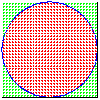
The ratio of the area of the circle to the square is:
\(\frac{\pi r^{2}}{4r^{2}}=\frac{\pi}{4}\)
So if we know the fraction of random points that are within the unit circle, then we can calculate \(\pi\)
(number of points in circle)/(total number of points)=\(\pi/4\)
from numpy.random import default_rng
rng = default_rng(42)
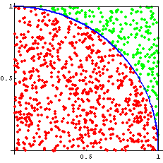
N = 1000
x = rng.random(N)
y = rng.random(N)
r = x**2 + y**2
np.sum(r < 1**2)/N*4
3.148
In this example with 1000 random x-, y-coordinates, we calculate the value of \(\pi \approx 3.148\). The accuracy of this result is
\(accuracy = error = \frac{|3.148 - \pi|}{\pi} = 0.2\%\)
What is the precision of the result?
The precision is a measure of the range of expected values. So, we need more trials.
rng = default_rng(41)

N = 1000

x = rng.random(N)
y = rng.random(N)

r = x**2 + y**2

np.sum(r < 1**2)/N*4
3.144
Using a seed = 41, the result is \(\pi = 3.144\). So far we can report that \(\pi = 3.146\pm0.002\) if we use the average of the calculations and the range = max - min.
The key part of Monte Carlo methods is to use lots of random numbers to get better results. We can run the same analysis \(100\times\) and see how much variation we get.
rng = default_rng(42)

N = 1000
trials = 100
pi_trial = np.zeros(trials)
for i in range(trials):
    x = rng.random(N)
    y = rng.random(N)

    r = x**2 + y**2

    pi_trial[i] = np.sum(r < 1**2)/N*4

mean_pi = np.mean(pi_trial)
std_pi = np.std(pi_trial)
plt.hist(pi_trial, 20, density=True)
x = np.linspace(3, 3.3)
pi_pdf = stats.norm.pdf(x, loc = mean_pi, scale = std_pi)
plt.plot(x, pi_pdf)
plt.title(r'Value of $\pi=${:1.3f}$\pm${:1.3f}'.format(mean_pi, std_pi))
Text(0.5, 1.0, 'Value of $\\pi=$3.140$\\pm$0.050')
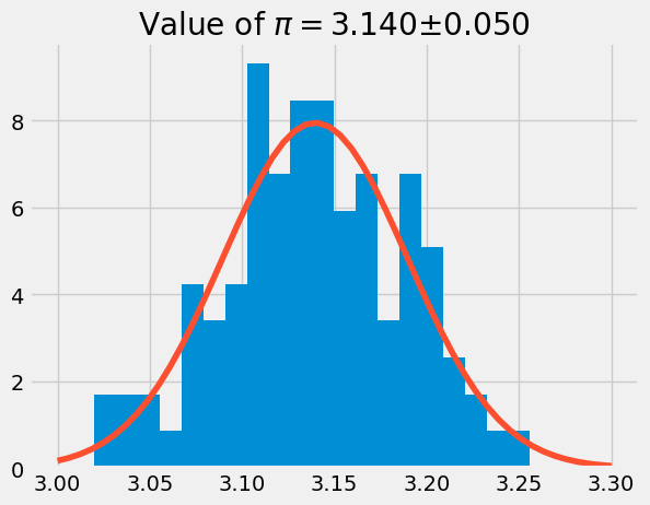
In the plot above, we calculate \(\pi\) 100 times using 1000 random x- and y-coordinates. The histogram has the data from the pi_trial and a normal distribution curve using the mean and standard deviation of pi_trial.
Many random variables fit this distribution, called the normal distribution.
Comparing with a normal distribution#
A normal (or Gaussian) distribution is a special type of distrubution that behaves as shown in the figure: 68% of the values are within one standard deviation \(\sigma\) from the mean; 95% lie within \(2\sigma\); and at a distance of \(\pm3\sigma\) from the mean, you cover 99.7% of the values. This fact is known as the \(3\)-\(\sigma\) rule, or 68-95-99.7 (empirical) rule.

Standard deviation and coverage in a normal distribution. Modified figure based on original from Wikimedia Commons, the free media repository.#
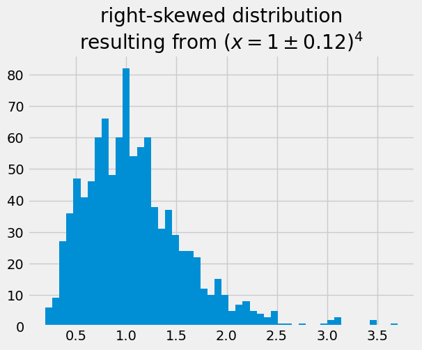
Many histograms don’t follow the shape of a normal distribution, known as Bell Curve. The calculated values of \(\pi\) are centered on the mean value, and they are symetric with respect to it. They are not skewed to the right or left. A right (or positive) skewed distribution looks like it’s been pushed to the left: the right tail is longer and most of the values are concentrated on the left of the figure. Imagine that “right-skewed” means that a force from the right pushes on the curve.
x4 = rng.normal(loc = 1, scale = 0.12, size = 1000)**4
plt.hist(x4, 50)
plt.title('right-skewed distribution\n'+r'resulting from $(x=1\pm0.12)^4$');
When the mean = mode and the histogram is symmetric, we typically report the mean, standard deviation and number of random numbers.